Spatial data manipulation
Pablo Gomez-Vazquez
Introduction.
Spatial data is usually represented in two different ways:
- Vectors: Represent objects in different dimensions.
- Raster: Represent continuous values in a grid.
Vector data
We can represent spatial objects in different dimensions:
- Point, is the most basic form of representing spatial data. It contains only the spatial coordinates of an even or object. For example, we use this to represent the spatial location of a farm, a capture of an animal or a case report.
- Line, Includes the spatial location of an object and the direction. we can use lines to represent a road, a river or a route.
- Polygon, Includes the spatial location and geometry of an object. We use polygon data to represent the shape of a building, lake or a administrative area.
Besides having the location of an object, we can include other characteristics such as the name, id, temperature recorded, number of animals in the farm, etc…
Raster data:
We use raster data to represent continuous values in a field. Raster are just a grid where each cell has a value and in a grid. The resolution of a raster just represent the size of the cells from the grid. We use raster data to represent values such as altitude, temperature, among other continuous values.
Spatial objects in R.
In this tutorial we will introduce to spatial data manipulation in R.
There are two main formats to manipulate spatial data in R:
- SpatialDataFrame from the sp package: This is was the first format introduced in R for spatial data manipulation, therefore, this package has a lot of dependencies (packages that uses this format to do other functions) i.e raster, spdep, spstat.
- Simple features from the package sf: THis is a more recently developed package, this package was developed to be more intuitive and friendly with other packages such as dplyr. The problem with this package is that since its more recent, some packages doesn’t support this format.
Working with both formats has its advantages, for spatial data manipulation sf is more intuitive and powerful, but for spatial analysis sp is more robust.
Here we will use mostly the sf package, but there will be times that we will need to switch between formats.
The package STNet was developed specifically for this workshop. All the data and some functions we will use are contained in the package.
The installation of this package is done from github, so we will need to install the packagedevtools to access the STNet package.
# If devtools is not installed we need to install it
install.packages("devtools")
# once installed we can use the following function to install STNet
devtools::install_github("jpablo91/STNet")
1. Loading the data
# Loading the libraries
library(STNet)
library(sf)
library(dplyr)
# Loading the data from the package
data("PRRS")
data("SwinePrem")
# Loading the spatial data from the package
Io <- st_read(system.file("data/Io.shp", package = "STNet"))
## Reading layer `Io' from data source
## `/Library/Frameworks/R.framework/Versions/4.1/Resources/library/STNet/data/Io.shp'
## using driver `ESRI Shapefile'
## Simple feature collection with 99 features and 2 fields
## Geometry type: POLYGON
## Dimension: XY
## Bounding box: xmin: -96.63567 ymin: 40.37454 xmax: -90.13931 ymax: 43.50465
## Geodetic CRS: WGS 84The st_read() function automatically shows some information about our shapefile, but we can see more details when printing the object into the console.
Io## Simple feature collection with 99 features and 2 fields
## Geometry type: POLYGON
## Dimension: XY
## Bounding box: xmin: -96.63567 ymin: 40.37454 xmax: -90.13931 ymax: 43.50465
## Geodetic CRS: WGS 84
## First 10 features:
## NAME_1 NAME_2 geometry
## 1 Iowa Adair POLYGON ((-94.24274 41.5030...
## 2 Iowa Adams POLYGON ((-94.4728 41.1566,...
## 3 Iowa Allamakee POLYGON ((-91.20658 43.4250...
## 4 Iowa Appanoose POLYGON ((-92.71506 40.5902...
## 5 Iowa Audubon POLYGON ((-94.74762 41.8609...
## 6 Iowa Benton POLYGON ((-91.83191 42.2986...
## 7 Iowa Black Hawk POLYGON ((-92.29958 42.2974...
## 8 Iowa Boone POLYGON ((-93.70088 42.2079...
## 9 Iowa Bremer POLYGON ((-92.08252 42.9061...
## 10 Iowa Buchanan POLYGON ((-91.60603 42.6437...The output shows:
- geometry type: The type of shapefile (either point data, lines or polygons). - dimension Dimensions used in the data.
- bbox: The extent of our data.
- epsg (SRID): The projection in the EPSG format (which is a standardized code to describe the projection).
- proj4string: The projection in proj4string format.
- And the first 10 features.
The sf objects are basically a data.frame with extra information about geometry, projection and CRS. We can ask for the geometry only using the $ operator or the function st_geometry()and then show it in a plot.
plot(Io$geometry)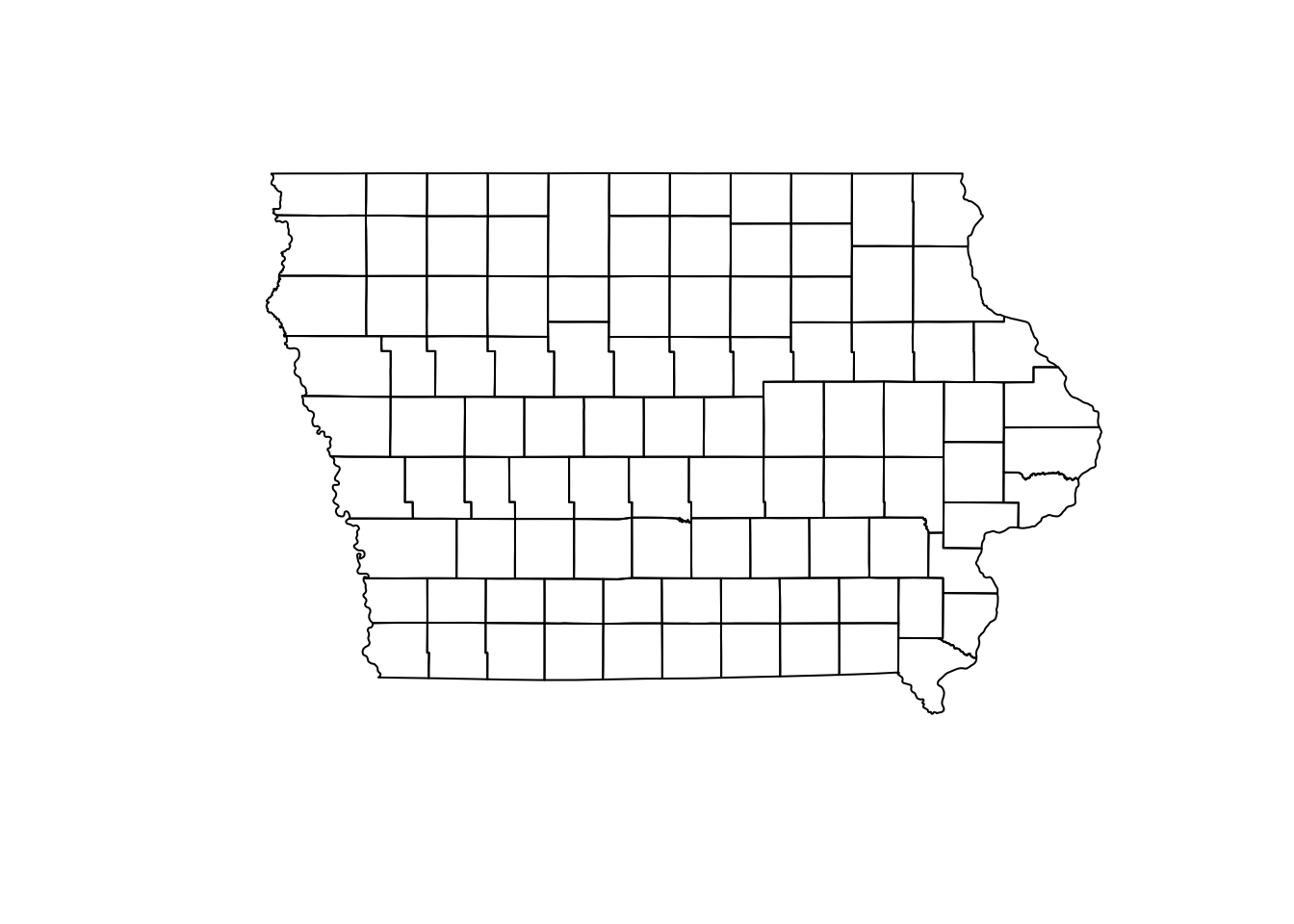
We can also extract only the data frame without geometry using the function data.frame():
data.frame(Io) %>%
  head() # We use this function to see the first 6 only
## NAME_1 NAME_2 geometry
## 1 Iowa Adair POLYGON ((-94.24274 41.5030...
## 2 Iowa Adams POLYGON ((-94.4728 41.1566,...
## 3 Iowa Allamakee POLYGON ((-91.20658 43.4250...
## 4 Iowa Appanoose POLYGON ((-92.71506 40.5902...
## 5 Iowa Audubon POLYGON ((-94.74762 41.8609...
## 6 Iowa Benton POLYGON ((-91.83191 42.2986...1.1 Converting from data.frame to sf
First we obtain the prevalence per farm:
PRRS_S <- PRRS %>%
  group_by(id) %>%
  summarise(N = n(), Cases = sum(Result)) %>% # Get the number of samples and positives
  mutate(Prevalence = Cases/N) # Estimate an apparent prevalence.
Now we join this new values with the locations of the farms (SwinePrem):
SwinePrem <- SwinePrem %>%
  left_join(PRRS_S, by = "id")
We can use the function st_as_sf() to transform the data.frame to sf. For this we will need to specify the data frame, coordinates and CRS.
Nodes <- SwinePrem %>%
  st_as_sf(coords = c("long", "lat"), # The names of the coordinates in our data
           crs = st_crs(Io)) # The CRS we will use.
1.2 Projecting the data.
Our spatial objects are not projected, which means that are we are representing the data in a planar scale without considering the earth curvature, something only a flat earther will do. The impact of the projection in our data will be associated with the size of our study area. In smaller areas the projection wont have a big impact, but as our study are increases the projection will have a bigger impact when calculating distances.
We can use the function st_transform() to set a projection to our data.
Iop <- Io %>%
  st_transform(st_crs("+init=EPSG:26975"))
Nodesp <- Nodes %>%
  st_transform(st_crs(Iop))
If we observe our map (projected and not projected) side by side, we can notice that there is a slight curvature on the straight lines such as the north and south borders.
par(mfrow = c(1,2), mar = c(0, 0, 0, 0))
plot(Io$geometry)
plot(Iop$geometry)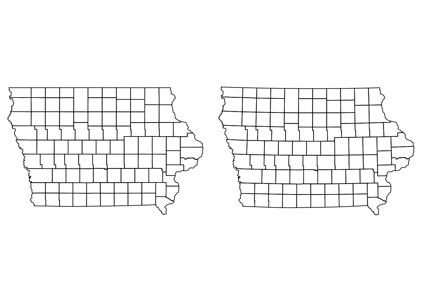
Now that we have our data correctly projected, we can improve the visual aspect of our map.
2. Data visualization
Point data
We can visualize multiple spatial objects in the same map adding several layers to our plot. We use the argument add = T in the layers we want to add to our base plot.
plot(Io$geometry) # Base map, first layer
plot(Nodes["Prevalence"], pch = 16, add = T) # Second layer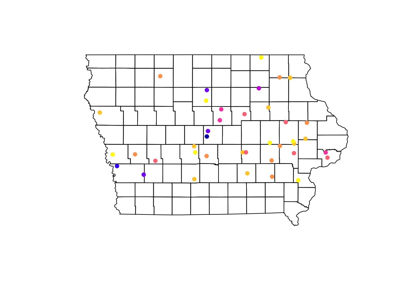
Using the information of the apparent prevalence by farm we can change the size of the point and color them by type of farm. We use the function rescale() from the scales package to rescale the points between 0.5 - 1.5 according to their apparent prevalence.
We can also add a legend that shows what they simbology means in our map. For this we use the function legend(), which will take multiple arguments such as the location, names to display, among others.
# We use the function rainbow to obtain a palette
colpal <- rainbow(length(levels(Nodes$farm_type)), # Number of colors needed
                  s = 0.6) # saturation for the colors

# Visualize the map
## background map
plot(Iop$geometry, col = "grey90", main = "Farm distribution and its prevalence")
## First layer
plot(Nodesp$geometry, # Spatial points object
     pch = 16, # Type of point
     cex = scales::rescale(Nodesp$Prevalence, to = c(0.5, 1.5)), # Size
     col = colpal[Nodesp$farm_type], # Color for the points
     add = T) # Add as a second layer for previous plot
## Legend
legend("topright", # Position of the legend
       legend = levels(Nodesp$farm_type), # Categories to show
       pch = 16, # Type of point
       col = colpal)  # Colors for the points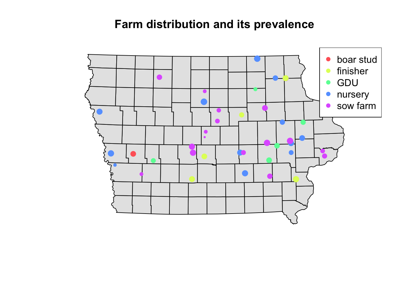
2.1 Choropleth Maps
We can aggregate the data at county level to create a choropleth map. First we will join the farm information with the county using a spatial joint with the function st_join(). This function will create duplicates of our counties since we have multiple farms per county, so then we will sum all the cases and number of observations using group_by() and summarise(), and calculate the prevalence at county level (instead of farm level).
Iop <- Iop %>%
  st_join(Nodesp) %>% # the data we are joining with
  group_by(NAME_2) %>% # group by county
  summarise_at(vars(N, Cases), .funs = ~sum(.,na.rm = T)) %>% # apply the sum function to the variables sN and Cases
  mutate(Prevalence = Cases/N) # get the apparent prevalence at county level
plot(Iop["Prevalence"])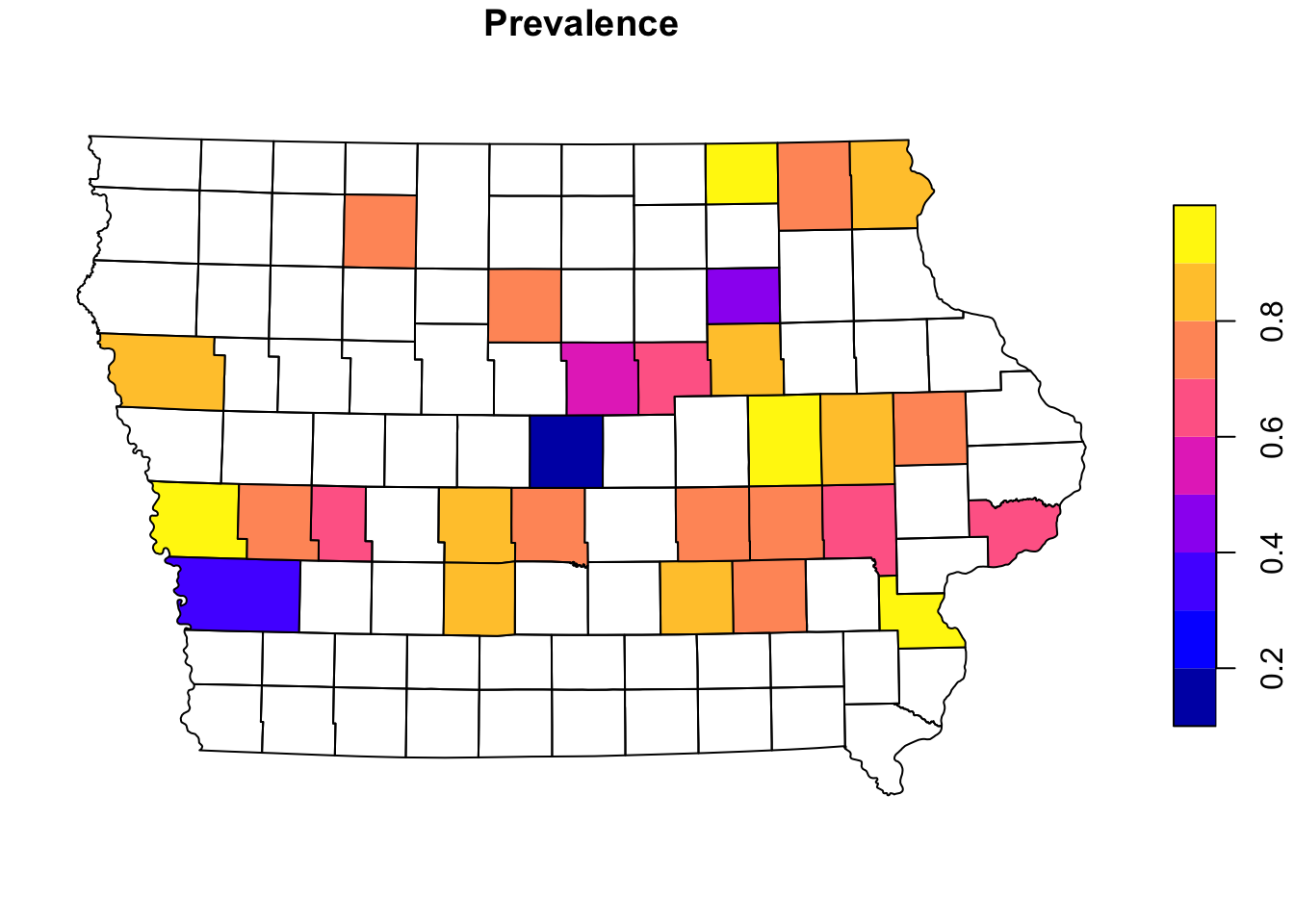
3. Other mapping libraries
There are other libraries that can be used to create maps in R, the base R functions for graphics can be very flexible, but require more knowledge about the functions in R. There ar other options such as tmap and ggplot that allow us to use more intuitive functions to create maps.
3.1 tmap
tmap has several options for mapping and with very similar syntax to the tidyverse packages (dplyr, ggplot2). We can create several maps and arrange them into a layout. For example, we can specify a predefined color palette for our map without the need of telling R how many colors we need.
library(tmap)First we create a map of the farms and their apparent prevalence
tm_shape(Iop) + # base layer
tm_polygons(col = "grey80") + # color of the base layer
tm_shape(Nodesp) + # second layer
# Options for second layer
tm_symbols("Prevalence", # Name of the variable we will use
size = 0.5, # Size of the points
legend.hist = T) + # Add a histogram
# Layout options
tm_layout(legend.outside = T, # We want the legend outside the box
frame = F, # remove frame
legend.hist.width = 3) # with of histogram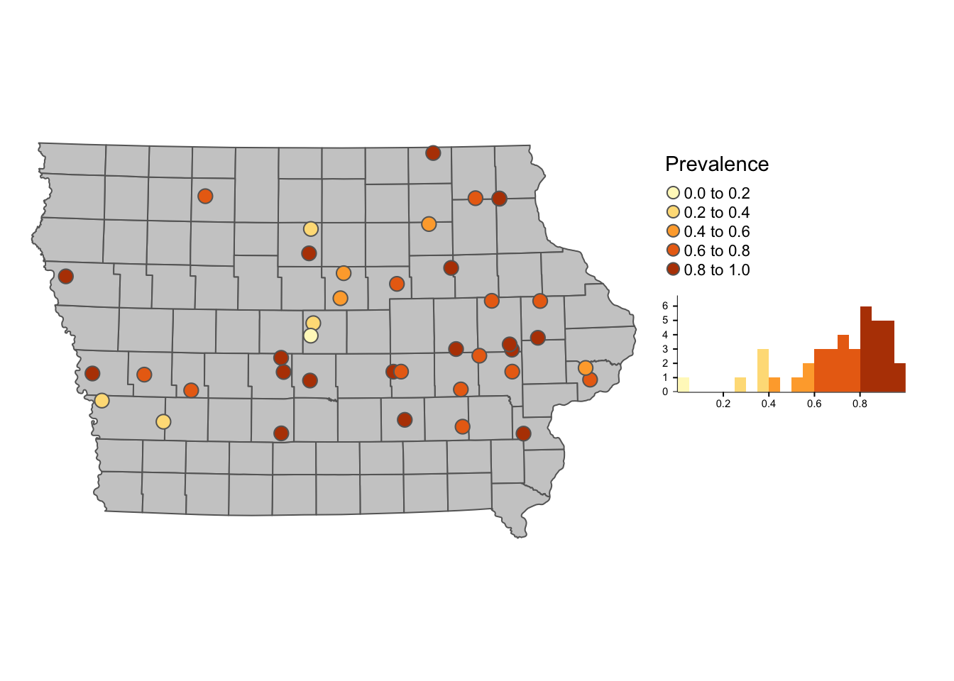 ### 3.1.1 Interactive maps
One of the nice things about tmap is that we can ver easy convert our static map into something interactive. We use the function tmap_mode() to switch between the interactive mode (‘view’) to the static mode (‘plot’). Now we will create a choropleth map like the one we did before, but add it as an interactive map layer.
tmap_mode('view')## tmap mode set to interactive viewingtm_shape(Iop) +
tm_polygons("Prevalence", palette = "-RdYlBu", alpha = 0.5) +
tm_layout(legend.outside = T, frame = F)3.2 ggplot2
ggplot2 is one of the most popular libraries for creating figures in R, we can add sf objects using the function geom_sf()
library(ggplot2)

p <- ggplot() + # first we call the ggplot() function
  geom_sf(data = Iop, # we specify our data
          aes(fill = Prevalence)) + # we use aes() to add the variables that we want to plot
  theme_void()

p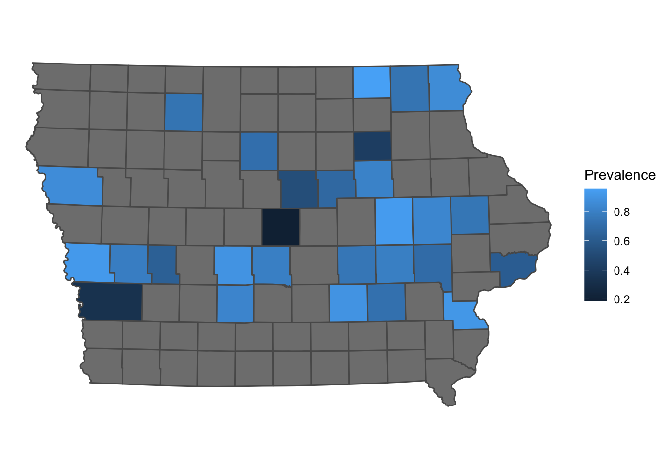
Similarly to tmap, we can also convert our map into an interactive map using the library plotly
# make sure you have it installed
# install.packages("plotly")
plotly::ggplotly(p)
ggplot and tmap have more personalization options that will not be covered in this tutorial. For more plotting information i recommend the R Graph Gallery which has several examples and code for making different types of plots
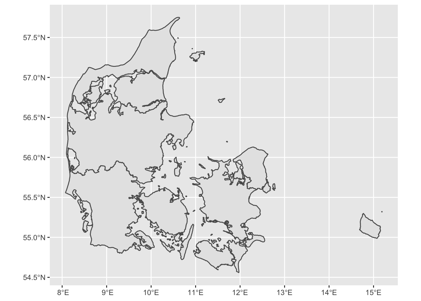
Getting data for other countries/regions
One of the easiest ways to get data from other countries or regions is downloading directly from R using the raster library. For example, we will get a shapefile for Denmark. The data will be downloaded in your computer and store in your project directory. Once downloaded you can just load it directly from your computer without internet connectiom with the function read_sf.
DK <- raster::getData(name = 'GADM', # this is the data source
                      level = 1, # Level of administration
                      country = 'DK') %>%  # country code
  st_as_sf() # Now transform the data to sf

# the dataset can be quite detailed, so we can simplify it to make it easier to plot
DK <- rmapshaper::ms_simplify(DK)
## Registered S3 method overwritten by 'geojsonlint':
## method from
## print.location dplyr# Plot the map
ggplot() +
geom_sf(data = DK)