Lab 2
In this lab we will review concepts of community detection and how to represent our network in a map.
First we will load the data and the libraries we will be using. Remember that on the previous lab we exported a data set at the end, we will continue using this objects.
# If you are starting a new session, load the files and libraries again
# Load the data
net <- readRDS("Data/Outputs/net.rds") # Loading the network object
node <- read.csv("Data/Outputs/node.csv") # loading the nodes
edge <- read.csv("Data/Outputs/edge.csv") # Loading the edges
# libraries we will use.
library(dplyr) # Data manipulation
library(sf) # Spatial data manipulation
library(tidygraph) # Network manipulation and analysis
library(purrr) # for data manipulation
library(ggraph) # for network visualization
library(ggpubr) # for arranging plots
1 Community detection
In this section we will use different algorithms to identify communities in our network.
# First we need to simplify the network
c <- net %E>%  # we call our network and activate the edges
  mutate(N = as.integer(1)) %>%  # create a variable for the number of movements (each row is 1 movement)
  convert(to_simple) %E>%  # now we will convert it to a simple network
  mutate(weight = map_int(.orig_data, ~.x %>% pull(N) %>% sum())) %N>%  # We have to sum all the repeated movements
  mutate(walktrap = factor(group_walktrap(weights = weight)), # use the walktrap algorithm for community detection
         infomap = factor(group_infomap(weights = weight))) # use the infomap for community detection
Then we will create an empty list to fill with plots and compare the different algorithms.
# Create the empty list
CP <- list()
# Make a plot for the edges only
pc <- c %>% # our simplified network
  ggraph(layout = 'nicely') + # call the ggraph function
  geom_edge_link() + # add the edges
  theme(legend.position = 'bottom') # set the legend position to bottom

CP[['Infomap']] <- pc + # We call our plot with only the edges
  geom_node_point(aes(col = infomap), size = 2) + # we add the nodes
  labs(title = 'Infomap') # title of our plot

CP[['Walktrap']] <- pc +
  geom_node_point(aes(col = walktrap), size = 2) +
  labs(title = 'Walktrap')

# We arrange our plots in a single figure
ggarrange(plotlist = CP)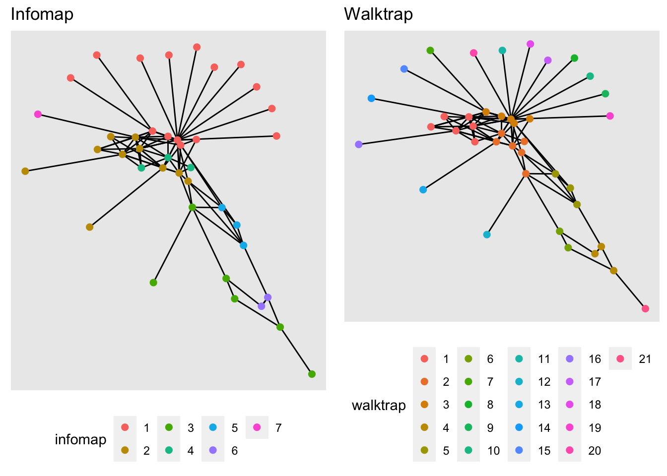
Excercise: Now increase the number of steps in the walk trap algorithm, what happens when we increase the number of steps? What do you think would be the optimal number of steps for this example
2 Spatial representation of the network
Now we will use the network we created and the spatial location of our farms to see the movements on a map.
We will be using the sf package to manipulate the spatial objects, and the ggplot2 package for visualization.
In the STNet package there is a spatial polygons data, which includes the counties in the state of Iowa.
# Loading the packages
library(sf) # Package for spatial objects
library(ggplot2) # package for plots

# We load the spatial object from the package STNet
iowa <- st_read(system.file("data/Io.shp", package = "STNet"))
## Reading layer `Io' from data source
## `/Library/Frameworks/R.framework/Versions/4.1/Resources/library/STNet/data/Io.shp'
## using driver `ESRI Shapefile'
## Simple feature collection with 99 features and 2 fields
## Geometry type: POLYGON
## Dimension: XY
## Bounding box: xmin: -96.63567 ymin: 40.37454 xmax: -90.13931 ymax: 43.50465
## Geodetic CRS: WGS 84# plot map using sf
plot(iowa$geometry)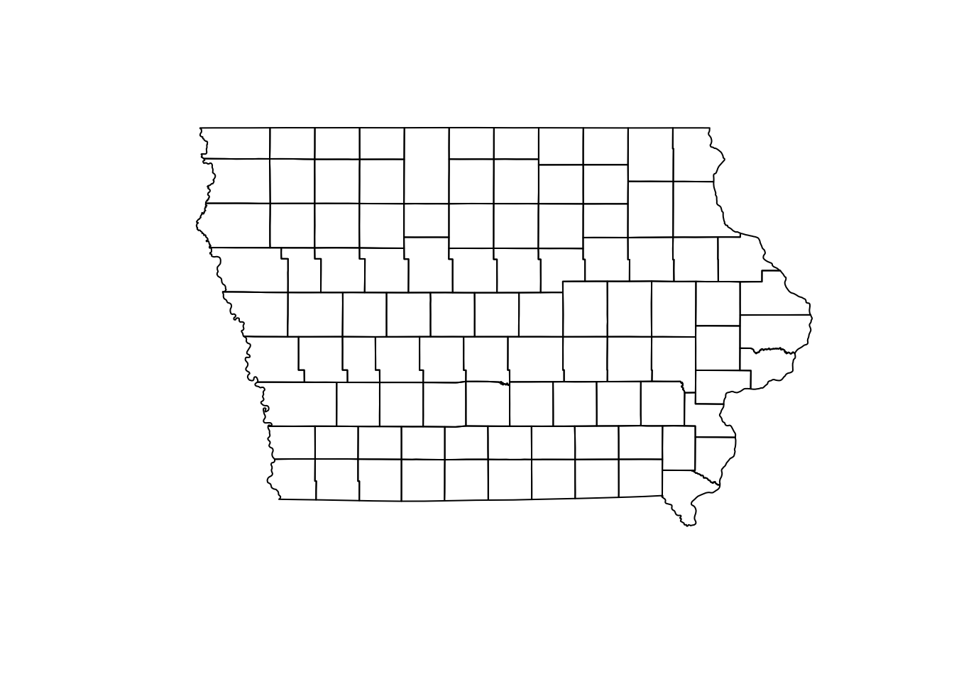
Next we will transform the nodes as a spatial points object, for this we use the function st_to_sf() and we need to specify the names of the columns that have the spatial coordinates.
NodeSp <- node %>% # This is our node data.frame
  st_as_sf(coords = c("long", "lat"), # Variables for the coordinates
           crs = st_crs(iowa)) # This is the CRS we are using
2.1 Plotting our map
One of the nice things of ggplot is that we can create a map and store it in an object and later we can keep adding layers to this map. So first we will create a map of the state.
map <- ggplot() +
  geom_sf(data = iowa, # name of the spatial dataset
          color="grey20", # color of the shape border
          fill="white", # fill of the shape
          size=0.4) + # width of the border
  theme_void() # This is a theme form ggplot
2.2 Plot the nodes
Once we have the base map of the state, we can add the spatial points data we created previously. We can specify the size of the points using a variable.
map + geom_sf(data = NodeSp, # name of our data
              aes(color = farm_type, # we color the nodes by farm type
                  size = indegree)) +
  ggtitle("Farms and their indegree") # the title of our plot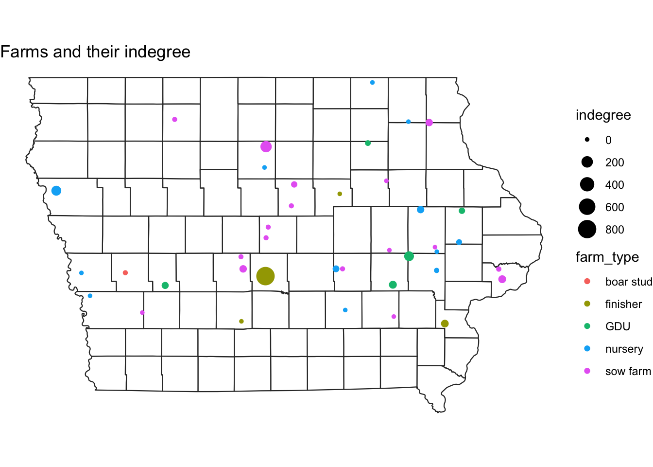
Excercise: Make the same plot, but make the size of the nodes relative to outdegree
2.3 Adding the euclidean contacts
In the previous lab we calculated the euclidean distance between each pair of farms involved in a movement. Here we will visualize those movements.
# The function geom_segment adds a straight line between two coordinates:
map +
  geom_segment(data=edge,
               aes(x=O_Long, y=O_Lat, # this is where the line starts
                   xend=D_Long, yend=D_Lat)) # this is where it ends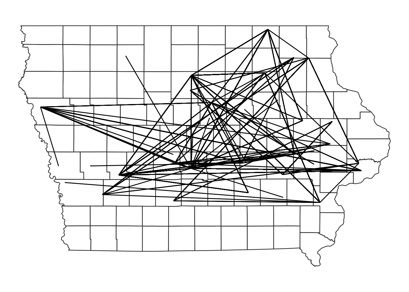
# We can add the information of the type of movement to change the color of the line and the number of animals for the transparency
map +
  geom_segment(data=edge,
               aes(x=O_Long, y=O_Lat,
                   xend=D_Long, yend=D_Lat,
                   color=type_orig,
                   alpha = pigs.moved))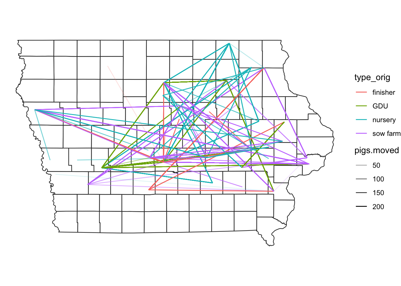
2.4 Putting everything together
Now we will add both the farm locations and the direction of the movements between the farms on a map.
#plot nodes & edges - add both commands geom_segment and geom_point#
map +
  geom_segment(data=edge,
               aes(x=O_Long, y=O_Lat,
                   xend=D_Long, yend=D_Lat,
                   alpha = pigs.moved),
               show.legend=F) +
  geom_sf(data = NodeSp,
          aes(color = farm_type,
              size = indegree), show.legend = "point")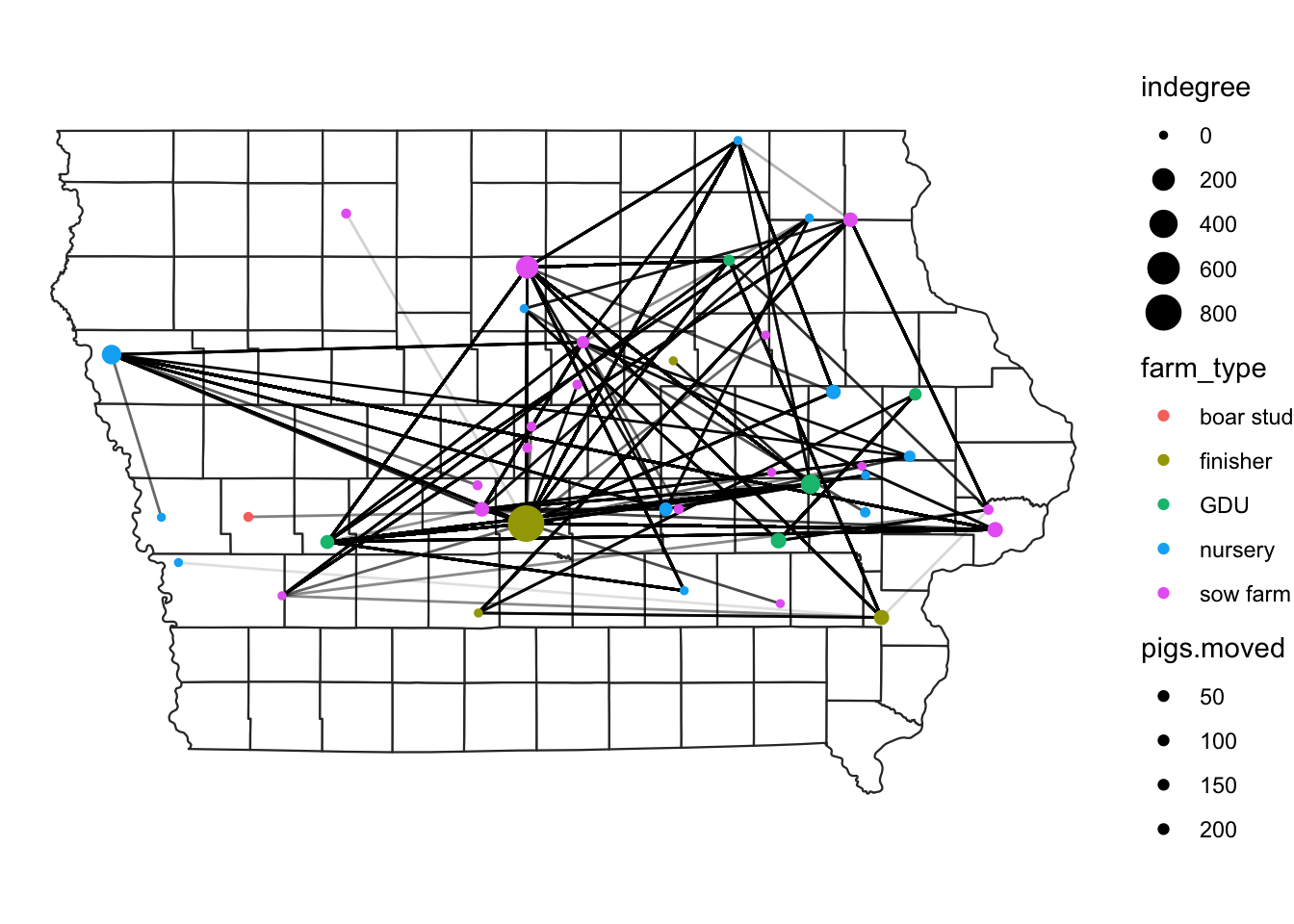
2.5 Subsetting the data
Sometimes we are interested in a particular type of movements. We can subset this using the dplyr functions such as filter(). In the next plot we will select only the movements that comes from sow farms.
# plot movements from sow farms only
map +
  edge %>%
  filter(type_orig == "sow farm") %>%
  geom_segment(data = .,
               aes(x=O_Long, y=O_Lat,
                   xend=D_Long, yend=D_Lat,
                   color = type_orig), show.legend = F) +
  geom_sf(data = NodeSp,
          aes(color = farm_type), size=3, show.legend = "point")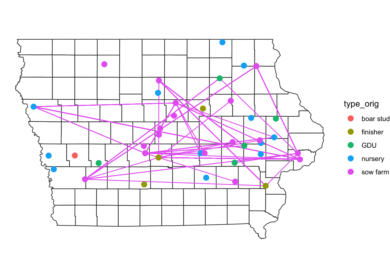
We can be even more specific and filter the movements from sow farms that are directed to GDU.
We will also add at the end the function ggplotly() from the package plotly to obtain a map were we can zoom and hover over some features to obtain more information.
# We store the map of movements between GDU to sow farm
m <- map +
  edge %>%
  filter(type_orig == 'GDU', type_dest == "sow farm") %>%
  geom_segment(data = ., aes(x=O_Long, y=O_Lat,
                             xend=D_Long, yend=D_Lat,
                             color = type_orig), show.legend = F) +
  geom_sf(data = NodeSp,
          aes(color = farm_type),
          size=3, show.legend = "point") +
  ggtitle("GDU to Sow farm Movments")

# We use the function from plotly to transform our map into n interactive map.
library(plotly)

ggplotly(m)
3 Kernel density map
Like we just saw, visualizing the movements can be challenging, one approach to do this is using a kernel density map. The idea behind this is to extrapolate values in a continuous surface, but here we are just interested in the visualization of the values, not so much in the interpolation of our values.
We will use the package KernSmooth for this, so make sure you ahve it installed.
First we will define a function to automate the process:
library(KernSmooth)
library(raster)
# we will create a function to create a density raster:
processRaster <- function(x, b, shp, res = c(200, 200)) {
  est <- bkde2D( # we use the function bkde2D to obtain our values
    x, # This will be our dataset
    bandwidth = c(b, b), # The bandwidth we define
    gridsize = res, # the resolution level we want
    range.x = list(extent(shp)[c(1, 2)], extent(shp)[c(3:4)])
  )

  # Add the results to a raster
  r <- raster(list(
    x = est$x1,
    y = est$x2,
    z = est$fhat
  )) %>%
    `projection<-`(st_crs(iowa)) %>% # set the CRS
    `extent<-`(extent(iowa)) %>% # set the extent
    crop(., iowa) %>% # crop the raster to the area
    mask(., iowa) # crop the raster to the stat shape

  return(r)
}
Now lets use our function for the data.
# Obtain the estimated kernel with bandwidth 2km
Erc <- processRaster(x = edge[,c("O_Long", "O_Lat")], # we want the outgoing only
                     b = 2, # we choose a bandwidth of 2
                     shp = iowa) # we set our extent

# plot the raster and the map
plot(Erc)
plot(iowa$geometry, col=NA, border = "grey80", add = T)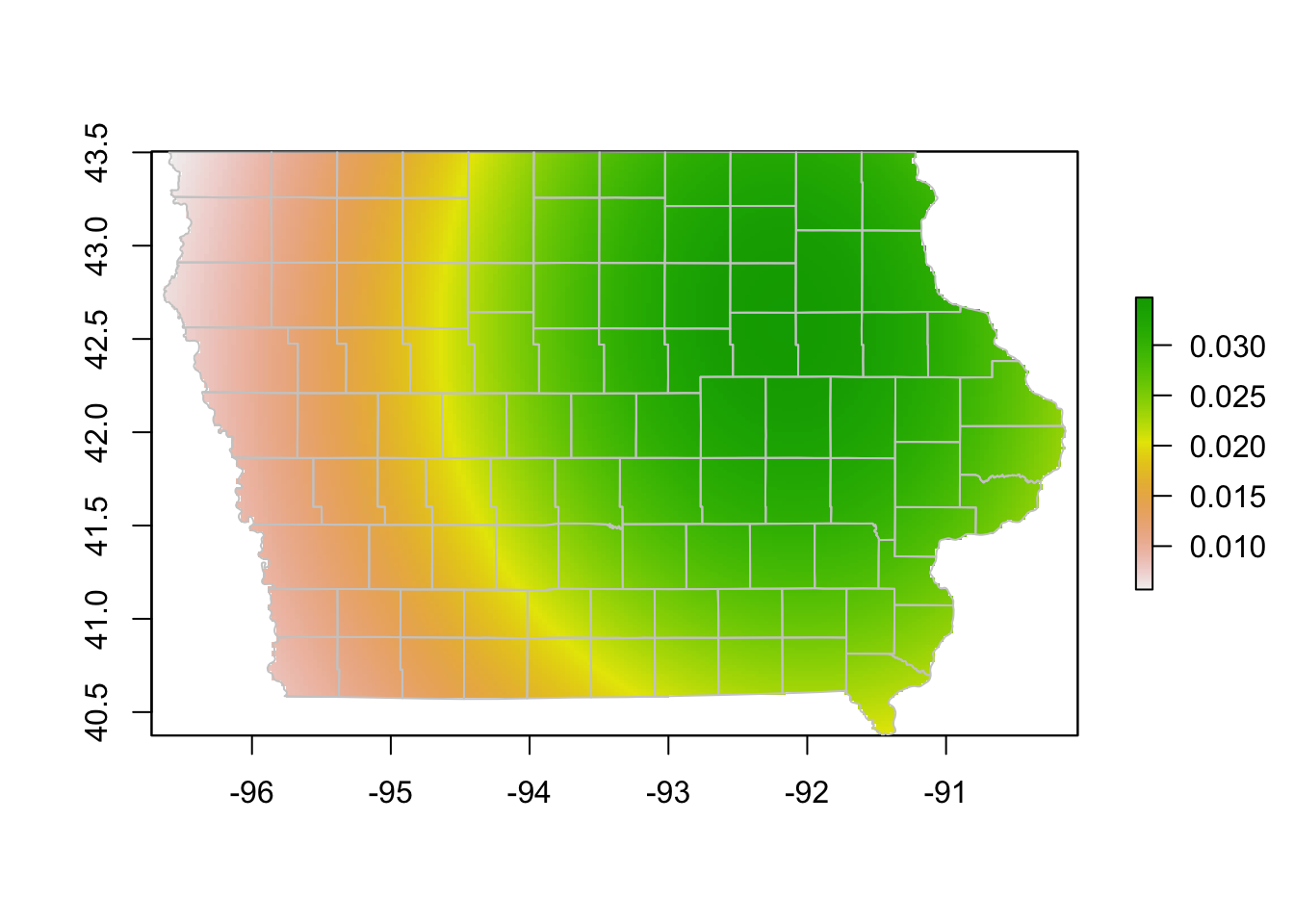
We might have used a very large bandwidth in the previous plot, lets try with a smaller size.
# Using a different bandwidth
Erc <- processRaster(x = edge[,c("O_Long", "O_Lat")],
                     b = 0.1,
                     shp = iowa)

# plot the raster and the map
plot(Erc)
plot(iowa$geometry, col=NA, border = "grey80", add = T)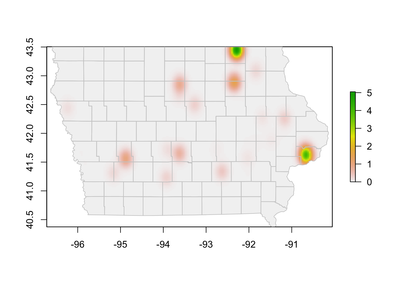
Exercise: Create a kernel density map for the incoming movements.
4 More on interactive maps.
If you are interested in more about interactive maps plotly also has option for using background maps, but for this you need to get a public Mapbox access token, which is free, but requires registration. Some great resources for more information:
Here I provide an example of the kind of maps you can get using mapbox, but this This code will not run unless you use your own API Key
# Sys.setenv('MAPBOX_TOKEN' = yourKey)

plot_mapbox() %>%
  add_segments(
    data = group_by(edge, id_orig, id_dest),
    x = ~O_Long, xend = ~D_Long,
    y = ~O_Lat, yend = ~D_Lat,
    alpha = 0.1, size = I(1), hoverinfo = "none"
  )   %>%
  add_markers(data = node,
    x = ~long, y = ~lat, size = ~indegree, text = ~id,
    split = ~farm_type,
    hoverinfo = "text"
  ) %>%
  layout(
    mapbox = list(
      style = 'open-street-map',
      zoom = 6,
      center = list(lat = 42, lon = -93)
    ))